three photographers (half-term work)
1st Photographer: Sequences
Duane Michals:
Duane Michals is an American photographer born on February 18th 1932 in McKeesport, Pennsylvania. For his education, he received a B.A at the university of Denver in 1953 and later in 1956, he went to Parsons school of design with plans on becoming a graphic designer. But he never finished his schooling career. It is said that Michaels discovered his love for photography during a trip to the U.S.S.R in 1958, and the photographs he took during this trip were used in his first exhibition in New York, 1963.
For a few years, Duane worked as a commercial photographer, even working for magazines like vogue in 1972. but he didn't have a studio so what he would do to take pictures of celebrities is that he would take pictures of them in their natural habitats, which was quite uncommon for photographers working in that area at the time.
Duane's arguably biggest achievement/project, was that in 1968, Duane Michaels was hired by the Mexican government to take pictures of the Mexican Olympics. These pictures were later shown with a collection of photos for an exhibition in 1970.
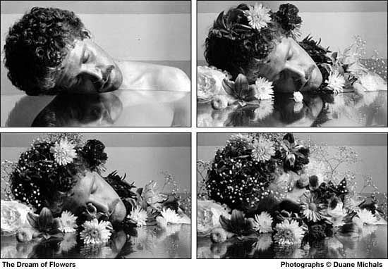
Fredi, you've spoken a lot about the photographer but not about the work below, which is the most important aspect here. Please describe the work, how it looks, how it was produced, and explain how it relates to your theme of Extreme Contrast.
Duane Michals:
Duane Michals is an American photographer born on February 18th 1932 in McKeesport, Pennsylvania. For his education, he received a B.A at the university of Denver in 1953 and later in 1956, he went to Parsons school of design with plans on becoming a graphic designer. But he never finished his schooling career. It is said that Michaels discovered his love for photography during a trip to the U.S.S.R in 1958, and the photographs he took during this trip were used in his first exhibition in New York, 1963.
For a few years, Duane worked as a commercial photographer, even working for magazines like vogue in 1972. but he didn't have a studio so what he would do to take pictures of celebrities is that he would take pictures of them in their natural habitats, which was quite uncommon for photographers working in that area at the time.
Duane's arguably biggest achievement/project, was that in 1968, Duane Michaels was hired by the Mexican government to take pictures of the Mexican Olympics. These pictures were later shown with a collection of photos for an exhibition in 1970.
Fredi, you've spoken a lot about the photographer but not about the work below, which is the most important aspect here. Please describe the work, how it looks, how it was produced, and explain how it relates to your theme of Extreme Contrast.
|
|
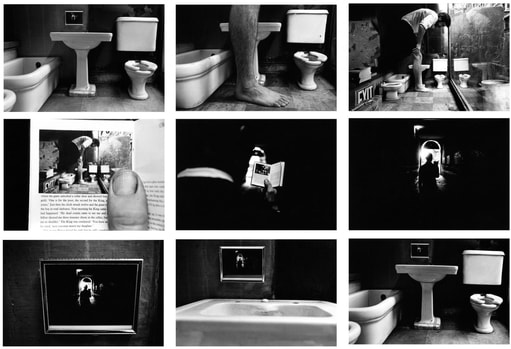
While looking at some of the photographers work, the pictures above really caught my eye, especially the one on the left as it relates quite heavily to contrast, in the sense that it is contrast of perspective. you think that you are looking at one thing but it ends up being something completely different. The photo on the left is, in my opinion, sequences, where there is a contrast as the photos progress, and you end up with an almost completely different photo from the beginning. Although I decided not to use his photos to take inspiration from as I didn't have the resources or time to complete them, which is why i decided to look at a new photographer.
2nd Photographer: Contrast in size
Christopher Boffoli:
Christopher Boffoli:
Christopher Boffoli was born in Worcester, Massachusetts, in 1969. He is most well known for his work, 'Big Appetites', which involves having mini figurines doing things on food, and is what I have based my own photographs off of.
Boffoli started his own commercial photography company while still in College, in Charleston, South Carolina, and then later on he worked as a philanthropic fundraiser for various schools and colleges for 12 years.
Boffoli started his 'Big Appetites' project after being inspired by childhood shows and also by admiring various other photographers works, including a 2002 London Chapman's Brothers exhibit of war dioramas. One thing Boffoli did, that I will be doing too, is that in his book where he showed his collection of images, he added a comment to complete the image. In an interview, Boffoli said, "You can't just stick a figure on a cupcake and call it a picture; You've got to think of the context of what the character is doing. For me, the caption is a way to reinforce the humour and the action in the photograph. People connect with the image first, but the caption gives it a snarky bump." He also said in the same interview, "context between the character and the food is important to making the picture work." However, I'd like to take that one step further and try to also add a quote of whatever the miniature figure in the photo could be saying, as if the situation were actually unfolding before us. I believe this would also further reinforce the comedy of the series.

Move your intentions that are below to here.
|

|


For this shoot, I wanted to do something different to Boffoli, and all the other photographers who have done this style of art, but to still stick to the fundamentals of the project. So I decided that instead of food, I would use everyday objects or things we would see in everyday life. And, as I would also being using miniature monsters that I played with as a child, I decided to have the photographs tell a story, Lord of the Rings-esque as it fit in well with the characters I was using. Above is a shoot that I have done for this strand.
Evaluate your shoot and select your best images to annotate.
Evaluate your shoot and select your best images to annotate.
3rd Photographer: Splash of Colour
History behind the technique (with famous examples)
When I finally decided on the topic that I would be working on, I instantly thought of this technique that has ben used extensively throughout film and photography history alike. Unfortunately, I struggled to find a photographer that had done a project with this style of art, so instead I decided to research into the history of this style, and also famous examples of this being used in movies.
Splash of Colour refers to a technique in which everything is monochrome, black and white, apart from one item or subject which is in colour. This effect is done in order to bring extra attention to that particular image, and if done correctly it can create a very beautiful or cool effect.
A famous example of a movie that has done this is Steven Spielberg's masterpiece, 'Schindler's list', where all of the movie is in black and white save one image of a girl with a yellow star of David pinned to her label in order to identify her. Her red coat is one of he very few instances of colour in this great movie.
For the shoot below, I wanted to kind of experiment with the technique and also look for cool instances of colour. This was mainly just to experiment with what I could do. I really enjoyed doing this as it is simple, yet fun and also pleasing to look at the finished product. That is why I chose to develop this and use it as my favourite strand further on.
Contact Sheet:
Fredi, I don't understand where are your images of black and white with "splashes of colour" as you put it? Please add your shoot intentions to the above shoot. I thought you had already begun to edit these. Please put these up ASAP.
4th Photographer: Contrast in Colour
Dirk Bakker:
Dirk Bakker:
Dirk Bakker is an amateur photographer from Amsterdam who take all his photos with an iphone camera. He has a history in graphic design which is what he says helped him managing to keep and eye out for extraordinary patterns and colour combinations.
Dirk also set up a company called 'SeeMyCity', which is a city marketing initiative that combines mobile photographs and social media to successfully show the beauty of certain cities.
For Dirk, photography had always been an interesting hobby for him but it didn't turn into . career until instagram, with the man now a famous influencer under the pename, 'macenzo'.
He currently has 426 k followers with over 2,000 posts of stunning street/mobile photography.
In response to Dirk only using mobile photographer, I too will be using my mobile phone to try and replicate his style and technique.
development:
For my development shoot, I decided to develop the splash of colour. However I didn't want to just do a repeat of what I had already done, so I decided to do splash of colour within videos, as seen in many famous movies and such. So what I will do is take short clips, 3 or 4 seconds long and then use the technique to have one thing within the clip in colour. And when analysing a photographer to take inspiration from, I will instead be looking at a famous movie example, that I mentioned before, called Schindler's List, by Steven Spielberg. I'm going looking in depth to the vert famous scene containing the red coated girl and discussing what the meaning of he colour red is within the movie and the context of the time.
Schindler's List and the meaning of red:
In the movie, there is practically no colour throughout, apart from two instances. The first is a scene where a jewish family are celebrating Shabbat, and a little red coat worn by a Jewish girl running away fro the Nazis. The red is what I'm mainly interested in as I believe it has a lot of hidden meaning behind it, including a considerable impact on the movie itself.
In the movie, there is practically no colour throughout, apart from two instances. The first is a scene where a jewish family are celebrating Shabbat, and a little red coat worn by a Jewish girl running away fro the Nazis. The red is what I'm mainly interested in as I believe it has a lot of hidden meaning behind it, including a considerable impact on the movie itself.
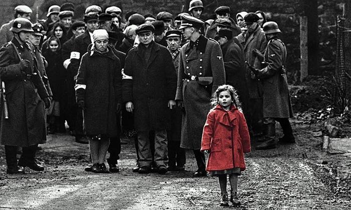
In the movie, the red represents the innocence of not only the little girl but also the innocence of the entire jewish community. And when the little girl turns up again later, in a pile of exhumed dead bodies, the girl in the red coat represents the death of innocence.
Red also has a lot of biblical meaning. In the bible, the colour red represents blood, and therefore represents humanity, among other things. This too adds a lot of meaning to the girl in the red coat.
Fredi, you have completed several artist research sections and done a few shoots. However, you are really behind with your work here, as you only have two shoots. By this point, before the pandemic took place, you were meant to have completed all of your first three projects and then, selected your favourite one to move ahead with and should have completed two shoots from that favourite strand. Whilst we have given you your Coursework marks, your final grade for GCSE Photography will consist of those plus Teacher Assessment. If you do not keep up with and complete the work we've set, those marks will drop down. Please go back and look at Google Classroom for all of your assignments and fix up, ASAP.
Everyday objects
New final piece due to complications during quarantine.
Edward Weston:
Edward Henry Weston was born on March 24th 1886 and died January 1st 1958. Weston has often been called one of the most innovative and influential American photographers, having taken photos of a wide variety throughout his long and decorated career. However the one that I believe to be some of his most interesting work is his still life's of ordinary everyday objects. I believe he truly utilises the black and white photography to its utmost and manages to add another layer to his otherwise plain photographs. His use of lighting is also formidable and pairs incredibly well with his black and white technique.
Edward Henry Weston was born on March 24th 1886 and died January 1st 1958. Weston has often been called one of the most innovative and influential American photographers, having taken photos of a wide variety throughout his long and decorated career. However the one that I believe to be some of his most interesting work is his still life's of ordinary everyday objects. I believe he truly utilises the black and white photography to its utmost and manages to add another layer to his otherwise plain photographs. His use of lighting is also formidable and pairs incredibly well with his black and white technique.
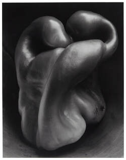
This probably my favourite photo of his. I find the way he managed to take something as wacky and abstract as a bit of wax into something that looks almost beautiful. The photo gives the meaningless blob of wax a meaning and gives it shape that can be truly studied by the viewer. And Weston has achieved this through only the use of light and shadows.
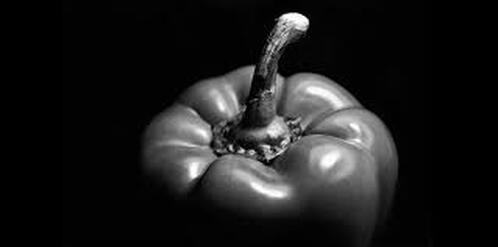
This photo is also one of my favourites for some of the same reasons as the previous one. It seems almost crazy to take a picture of a pepper. Yet Weston has managed to manipulate the light and shadows around the cracks and crevices to create a beautiful photo that someone could look at and study for hours to simply take it all in. I don't believe Weston would have been able to achieve the same effect as just taking a normal colour picture of the same pepper.
Andre Kertesz:
Andre Kertesz was born in Budapest in 1894 and died in New York city in 1985. He is widely considered to be one of the seminal figures of photo-journalism, although back when he was still taking pictures, due to his unorthodox style, he felt he never got the recognition he truly deserved although he has now got that recognition. Kertesz had to move from his hometown to America due to the rumours of the Nazi invasion of Budapest and how Hitler maltreated the Jewish people. It is also important to say that Andre briefly served in World War One. Below is an example of one of his most famous photographs and my thoughts on it.
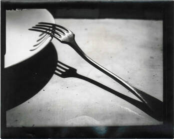
What I believe to be the most interesting thing about this piece is also one of the reasons that i really enjoy Weston's work, and that is the manipulation of shadows. While the fork itself is quite ordinary, the way Andre uses not only light to create shadows but also the effect of the plate on the shadow makes the work extraordinary and is also further reinforced when looking at other photos in the same series. It is an extremely clever picture that shows the viewer the artists real strengths when it comes to photography and the ability to make an everyday object seem fascinating and even beautiful.
Below are my attempts at shooting photos that use the same principles as Weston and Kertesz. The contact sheet and three final images will contain both inanimate objects and fruit, so as to let me fully explore the art style the two photographers were following.
Below are my attempts at shooting photos that use the same principles as Weston and Kertesz. The contact sheet and three final images will contain both inanimate objects and fruit, so as to let me fully explore the art style the two photographers were following.
